Tagged: saas marketing
The Ultimate Guide to Pricing Plans (+ Examples!)
- by Alyson Shane
Do you want to learn how to price your services so customers click on your preferred pricing plan? Have you struggled to drive customers towards the option you want them to select?
Then you've come to the right place! This article explores the psychology behind consumer marketing, and uses research and examples to show you how to price your products and services to drive consumer behaviour.
Why is understanding consumer psychology important?
Knowing why consumers choose one option over another helps us make more informed decisions about our pricing.
Being strategic in our pricing doesn't only improve conversions! Understanding the psychology behind pricing allows us to create positive experiences for our customers, which helps them feel happy about their decision to buy.
How can we help our customers feel this way while buying from us? Keep reading to find out:
The Decoy Effect, aka Asymmetric Dominance
"The Decoy Effect" describes our tendency to change our preference between two options when presented with a third, less enticing option.
The third option, known as the “decoy”, uses asymmetric dominance to push customers to choose between one of the two better options.
What is Asymmetric Dominance?
Asymmetric dominance means that the decoy is priced to make one of the other three options more attractive.
The decoy is “dominated” in terms of perceived value (price, quality, quantity, features, etc.) and isn’t actually intended to sell.
The decoy exists only to nudge customers away from the “competitor” and towards the “target” (usually the most profitable option.)
Real-life examples of The Decoy Effect
One of the most popular examples of The Decoy Effect comes from the researcher Dan Ariely. In 2009 he ran a study that analyzed the pricing options for The Economist with 100 MIT students.
In one scenario, he gave students the option between a web-only subscription or a print-only option for twice the price.
Not surprisingly, 68% chose the cheaper, web-only option.
When given a third option - a web-and-print subscription for the same price as the print-only option, just 16% chose the cheaper option.
Instead, 84% opted for the combined version because they perceived it as a better value.
In the second scenario, the print-only option became the decoy and the combined option became the target.
Here's a video of him explaining how the study worked:
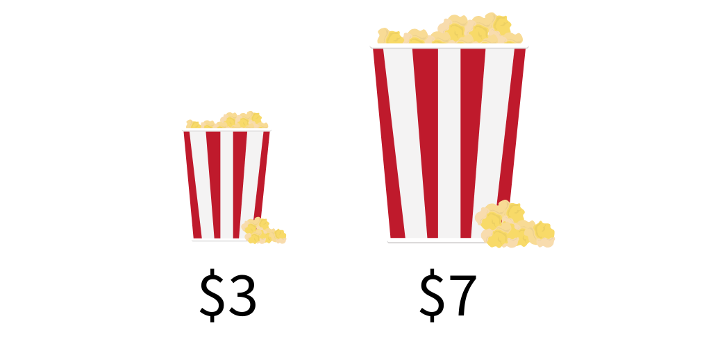
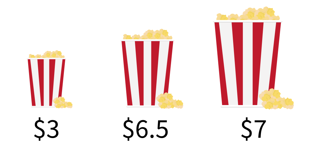
Another example of The Decoy Effect is an experiment by National Geographic to see if they could encourage customers to buy a large popcorn over other sizes.
They started with a small bucket of popcorn for $3, and a large bucket for $7.

The initial choice showed that most people bought the bucket of small popcorn.
When they added third, “decoy” option - a medium popcorn for $6.50 - most people chose the large bucket because they viewed it as being a better value.

In their test the medium bucket was asymmetrically dominated by the large one, so customers chose the more expensive option.
The Decoy Effect takeaway
Using decoys takes the guesswork out of selecting the option that has the most value.
Adding a decoy that you don't expect to sell may seem counter-intuitive, but an option that makes the others look better empowers your customers.
Decoys make customers feel like they're getting a "good deal" by choosing the asymmetrically dominant option.
Protip: don’t be afraid to experiment with different decoys to test which comparisons yield the results you’re looking for!
Anchoring Bias
Anchoring Bias describes people’s tendency to use the first piece of information they get as a reference point when comparing related items.
Again, researcher Dan Ariely is one of the leading voices on this subject. In his TEDTalk, he describes research for his book Predictably Irrational, which confirmed that we assess and compare items based on the first piece of information we're exposed to, known as the “anchor.”
Real-life examples of Anchoring Bias
Anchoring Bias in retail pricing
This is one of the oldest tricks in the book: cross out the retail price and show your price beside it. If you make handcrafted items, like jewelry or pottery, provide a range for retail price instead ($150 - $200).
Anchoring Bias in Pricing Services
If your business provides a service, use the same strategy listed above on your pricing page, but list the typical cost of the service instead.
Anchoring Bias in competitor price comparisons
Some businesses may want to consider showing their competitor’s prices for comparison. This tactic only works when
1) your price is actually lower, and
2) the comparison highlights extra benefits so your customer isn’t focused only on the price
But, beware: we don’t advocate pitting yourself against another competing company. Not only could they respond in kind, but aggressive tactics might turn off some customers.
Anchoring Bias in price comparisons
Create strategic price comparisons for your products and services to “anchor” the package you want to be the most popular in the middle.
You probably know what you want your ideal price for your product or service to be, so create a package that includes its features and benefits. Then, set this package in the middle of two other features.
On the left: create a slightly cheaper “base bones” package with very limited features.
On the right: create a much more expensive package with few extra features.
Placing your ideal option in the middle "anchors" it in the center, so anyone looking at it will subconsciously compare the other two options against it.
When done properly, most customers will naturally opt for the middle option because it appears cheap and offers the most value.
Anchoring Bias takeaway
The first thing we see sets the tone for how we assess related items, so set the stage for your ideal price by “anchoring” it against less valuable options.
Use visual tricks like crossing out retail pricing and strategically arranging packages to guide your customers to click on the option you want.
Protip: right-align your prices. Studies have shown that customers perceive a bigger discount when the sale price is positioned to the right of the original price.
The Paradox of Choice
The Paradox of Choice describes the psychological phenomenon that makes us feel overwhelmed by too many choices.
This is why many of us feel "analysis paralysis" when trying to choose between a lot of options.
When we have only a handful of options in front of us, we feel confident and less anxious about our choices.
Real-life examples of The Paradox of Choice
The most famous example of this paradox is the “Famous Jam Study” set up by researchers at Stanford and Columbia University.
Researchers set up two sampling stations at real-life supermarkets, one with 24 jam flavours, and one with six options.
They found that while more people stopped to sample at the station with 24 flavours, only 3% of shoppers made a purchase.
The table with six jams had fewer shoppers stopping to sample, but a whopping 30% of those who did purchase at least one jar of jam - a 900% increase!
The table with fewer options obviously outperformed the table with more options - but why?
The researchers found that the larger selection overwhelmed shoppers to the point where they weren’t able to make a decision they felt confident in… and so they made no decision at all.
The Paradox of Choice takeaway
Fewer choices reduce purchase anxiety and make the buying decision easier, so don’t overwhelm your customers with a bunch of overwhelming options.
Protip: use call-to-action statements like “Best value!” and “Customer Favourite” to help customers feel even more confident in their purchasing decision.
“Three Charms, Four Alarms”
Research shows that repeating a phrase three times makes it seem more true, but repeating it four times or more starts to make people feel skeptical.
To determine this, researchers Shu & Carlson asked participants to read about five items, each with a range of 1-6 positive claims about it. Their results found overwhelmingly that repeating a phrase three times makes it sound more trustworthy and true.
Specifically, the study also found that repeating the same claim four or more times reduced how trustworthy the participants rated the statement, while fewer repetitions “charmed” participants every time.
Real-life examples of “Three Charms, Four Alarms”
Finding examples of this principle in real life is actually pretty easy: most SaaS companies use this tactic to make their customers feel more comfortable and confident in their purchasing decision.
For reference, let’s compare a few different pricing pages:
Source: https://buffer.com/pricing/publish
Buffer’s pricing page has a lot going on, including calls-to-action, highlights text, and extra details to help customers feel more confident in their purchase - but you’ll note that there are only three options, not four.
We can see the same strategy applied to Sprout Social’s pricing options:
Source: https://sproutsocial.com/pricing/
Like Buffer, there’s a lot going on here - but it doesn’t feel as overwhelming because we’re only comparing three options.
Now, let’s compare Salesforce’s pricing page:
Source: https://www.salesforce.com/ca/editions-pricing/sales-cloud/
There are a lot of the same psychological factors at play in these three examples, but according to research the additional option on this Salesforce pricing page actually damages conversions overall by reducing customer confidence.
So why would Salesforce offer four options instead of three? We can’t know exactly why, but a guess would be that they’re testing various pricing decoys in order to promote the $150/month plan.
“Three Charms, Four Alarms” takeaway
Limit the number of choices to three whenever possible. Avoid two, or even one option, as binary choices can feel limiting to potential customers and a single “take it or leave it” option also doesn’t leave them feeling empowered and excited to buy.
Protip: use the “three charms, four alarms” trick in your marketing copy as well. Never miss out on a chance to create a sense of trust with your customers!
How to build your pricing plan
Now that we’ve covered the consumer psychology behind it, putting together a pricing plan that (gently) encourages customers towards our preferred option is easy. Just follow these steps:
- Include a “decoy” option. Use asymmetric dominance to price your decoy option so it makes one of your other options more attractive.
- “Anchor” your customer’s expectations. Use visual tricks like crossing out text and strategically arranging packages on your pricing page.
- Remember the “Paradox of Choice.” Don’t overwhelm customers by offering so many options that they feel too overwhelmed to make a choice.
- Use the “Three Charms, Four Alarms” rule. Research shows that three options build trust, while four or more options decrease trust - so include three pricing options!
Start building your pricing plan today
Using strategy and data to build a pricing plan that drives the sales you want and makes customers feel great about their choice is exactly the kind of thinking that helps businesses grow and thrive.
If you’re ready to start bringing strategy and clarity to your digital marketing, drop us a line and let’s chat.
If you’d like useful articles like this one hand-picked and sent right to your inbox once a week, subscribe to our newsletter.
If you have any thoughts on this piece, we’d love to hear it! Share your tips and feedback with us on Instagram, Twitter, Facebook or LinkedIn.

